5 Advantages of Minimal Web Design
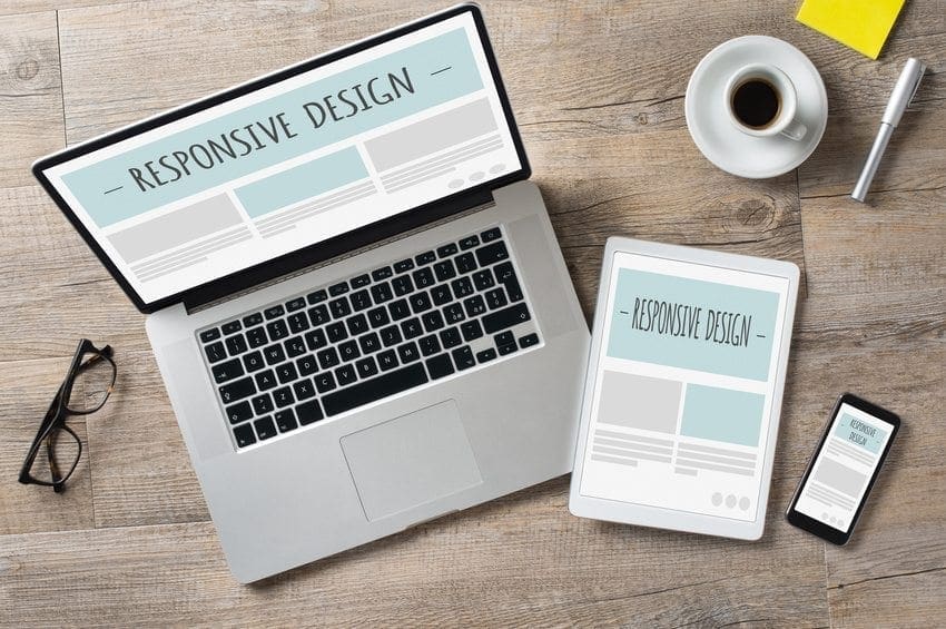
 From content creation and content marketing to search engine optimization and pay-per-click advertising, there are many strategies that a digital marketing company will use to promote a client’s website. But one of the most important ways to do this is through web design. Some 48% of people cited a website’s design as the number one factor in deciding its credibility, and 94% of people named web design as the reason they mistrusted or rejected a website. Professional web design can change everything for a site, but it’s also important to decide on the message you want to send with your web presence. Check out these reasons why a minimal design might be the right choice for you:
Faster Download Speeds
Loading times literally affect your bottom line — It takes no more than 50 milliseconds (that’s 0.05 seconds) for users to form an opinion about your website, and in that time you could lose or gain a potential client. In this age of instant gratification, the truth is that no business can afford to be slow — and the fewer components a site has, the less time it will take to load.
Easy Maintenance
It is of the utmost importance that all the pages on your site remain updated, and when there are fewer pages on a site, that task becomes instantly less daunting. Show your followers and customer base that you care by updating information in a timely fashion, and make that whole process easier on your web development team or web design agency with professional web design.
Focus of Content
Yes, people (and Google) love content, which makes it easy to assume that more is always better when it comes to the web. But in fact, there is often so much information and stimulation crowding a page that users tend to skim it all, or leave the page entirely. By whittling your content down, and concentrating on quality over quantity, you can easily focus the user’s attention on only what they need to know.
White Space
See above — people’s eyes and brains are on constant overload when it comes to the internet, and white space is a great way to let your site “breathe.” Seriously, user experience is everything, which brings us to…
Usability
Really, why do you think Apple is so successful? Well, mostly marketing, but also the fact that their products are designed to be so intuitive that a child could use them (which they do, in abundance). Follow this principle on your site, and let everything on your site be easy to find and navigate.
Professional web design should not be a luxury expense for your business, but rather a necessity. Depending on the impression users get from your site, you could generate a lot of leads.


