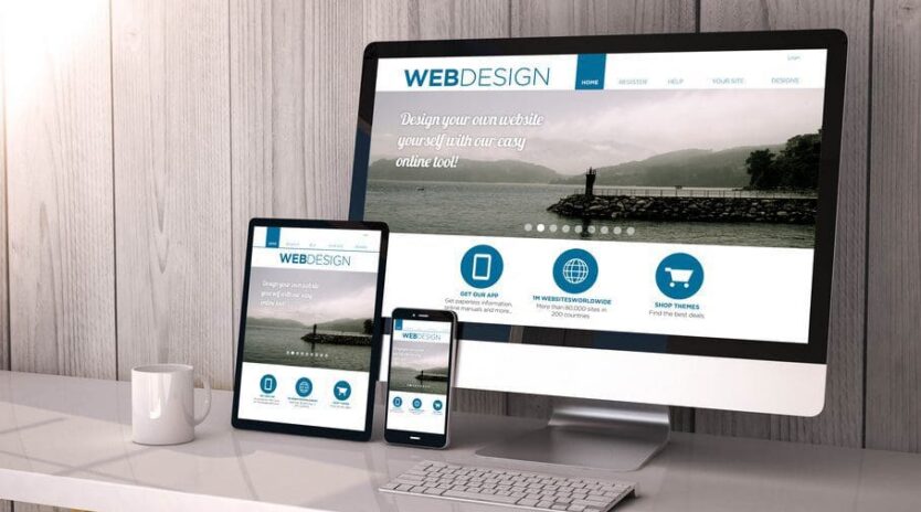
Fall 2016’s Best Web Design Trends
 Just like in fashion, web design trends are cyclical. Some of the hottest new styles aren’t actually new at all, but are borrowed from art and design geniuses of decades gone by.
That’s why the best web design firms are taking old ideas and giving them a 21st century spin. Here are some visual elements that are trending on the web right now.
Bringing Back the Serif
Designers love to play around with typography. In recent years we’ve seen a lot of ultra-thin, condensed sans serifs, which have become shorthand for a certain “hipster” aesthetic. In fact, the general rule has been to use sans serifs in order to increase readability, and few designers have dared to stray from that precedent.
Finally, in 2016, serif fans are having a moment. We’re seeing more designers return to traditional font styles that include serifs, particularly for large type. To maintain readability, they are creating a minimalist space for the text, using dark lettering on a blank, light background so that the words themselves are the stars of the show. Done right, these old school fonts bring us back to a simpler time.
Thinking Inside of the Box
Defined grids are really in right now. Whether you can actually see the grid or not is irrelevant. Either way, establishing a grid is the key to designing a clean, organized, and visually pleasing web page. The most well designed web pages of 2016 feature neat columns and rows without being overly flat, boring, and structured. Grids are also especially helpful for website development because they make sizing and placement extremely easy.
Stripping Above the Fold
If there is one thing all web design firms will agree on, it’s this — the information presented above the fold (the point at which you have to start scrolling) must be interesting enough to entice a visitor to scroll for more. The content and images positioned at the top of the page will make the first impression. Since it takes no more than 50 milliseconds for Internet users to form an opinion about your site, your content must be immediately eye-catching.
Some designers are taking a very unique approach to above-the-fold-design this year. They are stripping it bare and presenting a minimal amount of information. Some impressive sites include nothing but an image and a single word, and you know what? It’s intriguing. Sometimes less is more, and this is one of those times.
Your website should appeal to your audience, so one or more of these trends may not be a good fit for your brand. For the best advice, hire a professional web design firm to tailor your site to your particular marketing strategy.

