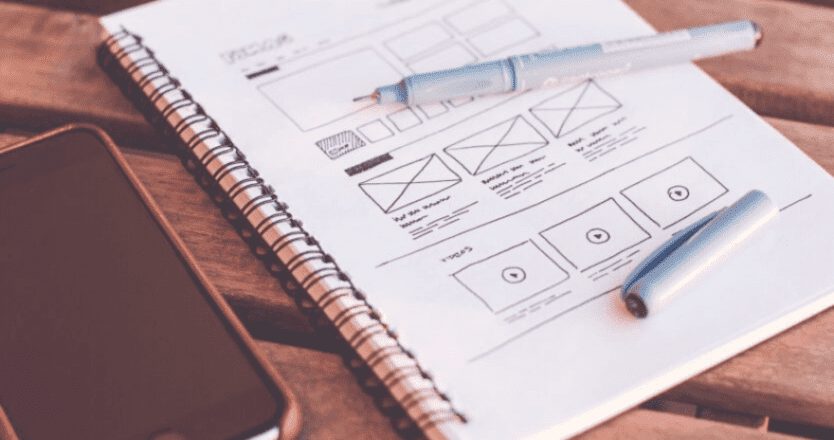
5 Mobile Web Design Template Trends of 2015 Your Website Still Needs
The year might be half over, but it isn’t too late to start incorporating some of 2015’s hottest trends in mobile web design templates — not just to revamp your website and keep it lookin’ fly, but also because you may have missed some important updates to mobile search engine optimization strategies which are hurting your business!
Although it’s always a good idea to consult with a digital marketing and web design service if you aren’t familiar with the basics of developing mobile web design templates, it never hurts to read up on what other businesses and web design experts are considering to be the most important and influential trends of the year:
- Muted color palettes. This isn’t to say that your color inspiration should come from a piece of plain white bread — but with so many advances in mobile advertising and digital media, it’s hard to keep a mobile screen from overstimulating the user. Instead of big pictures and embedded videos on auto-play, stick to something that reflects your brand most clearly.
- Custom background photography. One way to incorporate your business’s brand without looking too bland is to use one background image, taken by a professional photographer and designed so that it fits well with your text, navigation bar, and looks good on any size screen.
- Slide-out menus. It gets annoying when you can’t find a website’s navigation bar, but it’s just as annoying when these tabs take up half the screen on a smartphone. Slide-out menus haven’t been the go-to web design template for desktop screens, but they definitely don’t look bad on laptops — and when you get them on a tablet screen, they look fantastic.
- Fast loading and easy navigation. Okay, this isn’t really a new trend, and most web designers consider these points fundamental for responsive web designs — but it’s still important! If your customers can tell you mean business by your website, then they’re 48% more likely to trust you and engage with you.
- Bigger and better typography. Times New Roman and Arial are so 2005. This doesn’t mean you get a free pass to use Comic Sans or Webdings, nor does it mean that you should use a mixture of seven handwriting-styled fonts. Rather, keep the typography big and bold when it matters — pick something that makes a good impression, since visitors will form an opinion of your business and website within .05 seconds of opening the page.
The most important thing to remember is simply that you can’t ignore mobile web design templates anymore! Around 50% of consumers see their smartphones as their primary internet sources now, and that number is only going to keep increasing.


