How to optimize for Mobile SEO: Google now ONLY looks at your mobile website.
Most businesses know that in order to be seen by search engines, and consequently, customers, it is important to embrace search engine marketing (now focusing on Mobile SEO) and optimize their website so that it shows up early in web results. It is also important that once a customer, or prospect reaches that website, it is easy to navigate and interactive no matter what kind of device initiated that search. That’s why paying attention to SEO isn’t enough anymore. More and more companies are reaching out to an SEO agency in order to assure their search engine marketing plan is fully mobile compatible.

The Takeover of the Mobile Search
Today’s world is on the move, and when people want to know something, they aren’t going to hold off and wait until they are back at home or at the office in order to search using their computer. They’re going to do that search on their phone or tablet that is much easier to reach. As recently as 2011 there were still nearly three times as many desktop searches as mobile searches, but that has changed.
In 2016, over half of all searches are conducted using a mobile device, rather than a desktop computer. Desktop searches began to taper off in 2015. Between 2015-2016, the number of desktop searches grew by 1.6 billion– the lowest growth ever. Meanwhile, mobile searches shot up by over 27 billion. For this reason, more and more search engine marketing efforts are being aimed at mobile SEO.
Google is Speaking Mobile, You Should Too
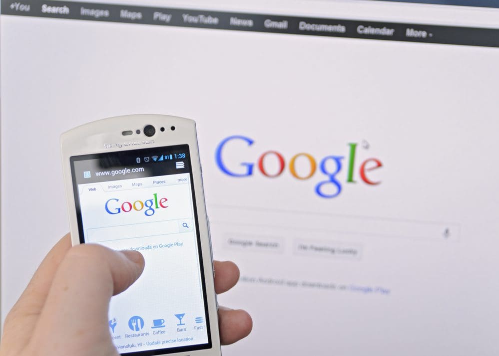
One thing that hasn’t changed, is Google’s dominance in the area. When people search for something, 95% of the time, they use Google. In an effort to keep their users happy, and assure they are finding the information they are looking for, Google’s algorithm has begun to favor mobile users, with mobile SEO friendly web pages appearing in the top positions of search results. Those businesses that have only optimized for desktops are getting pushed pages into the search, where few will bother to find them.
By catering to mobile users, Google is doing the right thing. With more people doing their primary searches on their phones or tablets, it is important that those users can easily read and access the information they find without awkward zooming in and out or coming across video content that is unplayable on a mobile device. At the same time, desktop searches aren’t dead either, with these new developments, it is more vital than ever that websites have a fully functional mobile version, as well as their desktop version.
How to Configure for Mobile SEO:
As more and more people have been reaching to their mobile device in order to access information and navigate the web, it has become increasingly important that people not only find what they are looking for, but that they also have a positive experience once they get there. It’s also important that that positive experience continue if and when they do decide to conduct further research on their computer. Finding the best way to keep everyone happy has been an evolving challenge, which has been approached in a variety of different ways. Here are a few.
1. Separate Web Address for Mobile and Desktop Websites
Most people who have conducted a few searches on their phone have noticed that in many cases their search result URLs often go to a mobile version of the website with a name something like m.website.com, rather than website.com. While many companies can make this method work for a while, it can get cumbersome to manage both a mobile and a desktop version and keep things user-friendly for both.
2. Dynamic Serving
All content on the same URL, but shows differently depending on user’s device. Upkeep is hard, as new versions of websites need to be created as new devices hit the market. Layout for content attempts to be very specific, which can mean a very good experience for some customers, but a disaster for others.
3. Responsive Design
A Responsive Website Design Is able to respond to each individual user. whether they are using a smaller phone, a larger screened phone, or a small tablet, all with using the same URL.
4. AMP Pages
AMP is short for Accelerated Mobile Pages. These pages are a shortened version of the regular desktop page, and are designed to load up to four times faster than the desktop version. Amp is supported by Google, and in many cases results in a higher page ranking. The faster loading time also helps with keeping users from abandoning their searches and helps them to stay more engaged on your website.
But there is a downside too. With a scaled back page, you lose a lot of control over your content, including ads, branding, and link building.
How Do You Know If It Works for Mobile SEO?
Mobile usability issues can be discovered by conducting usability tests with Google’s Mobile-Friendly Test. The test lets you test the URL for your business and will tell you whether it is mobile friendly or not. If there is trouble loading pages, or if there are resources that cannot be fully taken advantage of, such as video or Flash content, or if the page is unable to load fully. If Google sees too many problems, and those problems are not fixed, it is likely that other sites that are more mobile-friendly than yours will be prioritized in search results, leaving you and your business behind.
The world of search engine marketing, including mobile SEO is changing constantly, and chances are your company doesn’t have a single person or department that can stay on top of those changes enough to see that you continually come on top as far as web search results go. By working with an SEO company, any potential challenges can be identified and overcome.